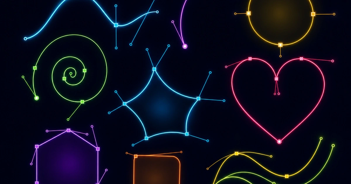
SVG looks intimidating at first glance — it's XML, it has a coordinate system, there's math involved — but once you understand the mental model, it becomes remarkably practical. It's the only image format on the web that's also a programming language.
What SVG Actually Is
SVG stands for Scalable Vector Graphics. Unlike JPEG or PNG, which store color values for a grid of pixels, SVG stores a description of shapes: "draw a circle at this position with this radius," "draw a path following these coordinates." The browser's rendering engine interprets that description and draws the result at whatever size you ask for.
That "at whatever size" part is the key property. A pixel-based image has a fixed resolution — enlarge it past its native size and you see blurriness or blocky pixels. An SVG renders at device resolution regardless of display size. A 24×24px icon looks identical on a standard screen and a 3x Retina display. Your logo scales from a 16px favicon to a billboard with no quality loss.
SVG is XML. Two important consequences: you can write it by hand, and you can manipulate it with code.
The viewBox and Coordinate System
The viewBox attribute defines the internal coordinate space of an SVG. It takes four values: min-x min-y width height.
<svg viewBox="0 0 100 100" xmlns="http://www.w3.org/2000/svg">
  <!-- coordinate space is 0-100 in both dimensions -->
  <circle cx="50" cy="50" r="40" fill="royalblue" />
</svg>
This SVG has an internal coordinate space of 100×100 units. The circle is centered at (50,50) with a radius of 40 units. You can display this SVG at any size — 24px, 200px, 2000px — and the circle will always be centered and fill ~80% of the bounding box.
The viewBox decouples the internal coordinate system from display size. Set width="100%" or width="24" on the <svg> element and the browser scales the viewBox to fit.
The Key Elements
path
path is the most powerful and most common SVG element. It uses a mini-language of commands to describe arbitrary shapes.
<path d="M 10 10 L 90 10 L 90 90 L 10 90 Z" fill="none" stroke="black" />Commands:
M x y— Move to (x, y), pen upL x y— Line to (x, y)C x1 y1 x2 y2 x y— Cubic bezier curveA rx ry rotation large-arc sweep x y— Elliptical arcZ— Close path (line back to start)
Lowercase versions (m, l, c) use relative coordinates instead of absolute. Most SVG icons are entirely composed of path elements — it's what export tools like Figma and Illustrator generate.
Basic shapes
SVG has convenience elements for common shapes:
<rect x="10" y="10" width="80" height="80" rx="8" fill="coral" />
<circle cx="50" cy="50" r="40" fill="gold" />
<ellipse cx="50" cy="50" rx="45" ry="30" fill="lightblue" />
<line x1="10" y1="10" x2="90" y2="90" stroke="black" stroke-width="2" />
<polyline points="10,10 50,50 90,10" fill="none" stroke="purple" />
<polygon points="50,10 90,90 10,90" fill="tomato" />
rx on a <rect> rounds the corners — the equivalent of CSS border-radius.
text
Text in SVG is actual, selectable, searchable text — not rasterized into pixels.
<text x="50" y="55" text-anchor="middle" font-family="system-ui" font-size="14">
  Hello, SVG
</text>
This is why SVG is excellent for charts, diagrams, and infographics. The labels remain accessible and selectable rather than being baked into an image.
g and defs
<g> groups elements together, allowing transforms and styles to apply to the whole group. <defs> defines reusable elements (gradients, filters, patterns, symbols) that are referenced elsewhere.
<defs>
  <linearGradient id="grad" x1="0%" y1="0%" x2="100%" y2="0%">
    <stop offset="0%" stop-color="#f5c842" />
    <stop offset="100%" stop-color="#fb923c" />
  </linearGradient>
</defs>

<rect width="100" height="40" fill="url(#grad)" />
<symbol> defines a reusable shape that can be instantiated with <use>:
<defs>
  <symbol id="icon-check" viewBox="0 0 16 16">
    <path d="M2 8 L6 12 L14 4" stroke="currentColor" stroke-width="2" fill="none" />
  </symbol>
</defs>

<use href="#icon-check" width="16" height="16" />
<use href="#icon-check" width="32" height="32" x="20" />
Inline SVG vs img src vs CSS Background
How you embed an SVG changes what you can do with it.
Inline SVG (<svg> directly in HTML) gives you full CSS and JavaScript access to every element inside. You can target individual paths, animate them, change colors based on state, respond to hover and click events on specific parts of an icon.
<button class="btn">
  <svg viewBox="0 0 24 24" width="16" height="16" aria-hidden="true">
    <path d="..." fill="currentColor" />
  </svg>
  Save
</button>
The currentColor value inherits the CSS color property from the parent element. Change the button's text color, the icon follows. This is the standard approach for UI icons.
<img src="icon.svg"> loads the SVG as an external document. It renders and scales correctly, but you have no access to the SVG's internals — you can't change colors or animate paths from external CSS.
CSS background image (background-image: url('icon.svg')) has the same limitation. No access to internals, no currentColor inheritance. Useful for decorative backgrounds but limited for interactive UI elements.
Rule of thumb: inline SVG for icons that need to respond to state or inherit color; <img> for standalone illustrations; background image for decorative patterns.
Styling SVG with CSS
When SVG is inline, CSS applies normally:
.icon {
  fill: currentColor;          /* inherit from parent */
  stroke: none;
  transition: fill 0.2s ease;
}

button:hover .icon {
  fill: var(--accent);
}
fill and stroke are SVG-specific CSS properties. fill is the interior color of shapes. stroke is the outline color. stroke-width, stroke-linecap, stroke-linejoin control how strokes render.
currentColor is the key trick for themeable icons. It lets one SVG work correctly in dark mode, light mode, on colored backgrounds, and in disabled states without any JavaScript.
Animating SVG
Two approaches exist, and they're not equivalent.
CSS animations work on SVG elements the same way they work on HTML elements:
@keyframes spin {
  from { transform: rotate(0deg); }
  to   { transform: rotate(360deg); }
}

.spinner {
  transform-origin: center;
  animation: spin 1s linear infinite;
}
SMIL (Synchronized Multimedia Integration Language) is SVG's built-in animation syntax:
<circle cx="50" cy="50" r="40">
  <animate
    attributeName="r"
    values="40;20;40"
    dur="2s"
    repeatCount="indefinite" />
</circle>
SMIL was deprecated by Chrome, then un-deprecated, and remains in a gray zone. For new work, CSS animations are the safer choice — better tooling support, easier to control with JavaScript, and no dependency on SVG-specific parser behavior.
For complex animations, GreenSock (GSAP) is the standard library used by most production SVG animation work.
Optimizing SVGs with SVGO
SVG files exported from Figma, Illustrator, or Sketch contain significant bloat: editor metadata, unused definitions, redundant coordinates, verbose path data that could be simplified.
SVGO (SVG Optimizer) is the standard tool for cleaning this up:
# Install
npm install -g svgo

# Optimize a file (overwrites in place)
svgo icon.svg

# Optimize a file and write to a new path
svgo icon.svg -o icon.min.svg

# Optimize all SVGs in a directory
svgo ./icons/*.svg

# List available plugins
svgo --help
Typical savings are 20–50% of file size with no visual change. On a large icon library, this adds up significantly.
SVG as an Icon System
Instead of individual SVG files per icon, many teams build a sprite system: a single SVG file containing all icons as <symbol> elements, with each <use> tag referencing the appropriate symbol by ID.
<!-- Single sprite file included once in the document -->
<svg xmlns="http://www.w3.org/2000/svg" style="display:none">
  <symbol id="icon-home" viewBox="0 0 24 24">
    <path d="M3 9l9-7 9 7v11a2 2 0 0 1-2 2H5a2 2 0 0 1-2-2z" />
  </symbol>
  <symbol id="icon-search" viewBox="0 0 24 24">
    <circle cx="11" cy="11" r="8" />
    <line x1="21" y1="21" x2="16.65" y2="16.65" />
  </symbol>
</svg>

<!-- Use icons anywhere -->
<svg width="24" height="24"><use href="#icon-home" /></svg>
<svg width="24" height="24"><use href="#icon-search" /></svg>
This approach serves all icons in a single HTTP request, keeps individual icon references small, and allows currentColor to work for each <use> instance.
When SVG vs Raster
Use SVG when the content is geometric or illustrative, needs to scale to multiple sizes, needs to respond to state changes via CSS, or contains text that should remain selectable. Logos, icons, charts, diagrams, maps, UI illustrations.
Use raster (WebP, AVIF, JPEG) when the content is photographic, contains complex textures, or was captured rather than drawn. Photographs, product images, screenshots of complex UIs.
These formats aren't competing for the same use cases. They answer different questions.
Wrapping Up
SVG's combination of infinite scalability, CSS integration, and text-based format makes it the right choice for anything that isn't a photograph. The SVG specification at W3C is thorough and well-organized. If you need to convert raster images to work alongside your SVGs, Image Convert and Image Compress handle the raster side of the equation. For a broader look at how SVG fits alongside JPEG, PNG, and WebP, read Image Formats Explained.
FAQ
Should I use inline SVG or ` ` for icons?
Inline SVG for icons that need to respond to state, inherit color via currentColor, or animate via CSS. <img> for standalone illustrations or when you want browser caching of the SVG file. Inline adds bytes to your HTML; <img> adds an HTTP request. For a small icon set used many times, sprite (one SVG file with <symbol> elements, referenced by <use>) gives the best of both.
Why does my SVG icon ignore my CSS color?
Almost always because the SVG has hardcoded fill attributes on its paths. Replace fill="#000" with fill="currentColor" (or remove the attribute entirely and set fill: currentColor in CSS). The currentColor value inherits from the parent's color property, which is what makes themable icons work. SVGs from designers usually have hardcoded colors; the cleanup is a one-time edit.
What's the difference between viewBox and width/height?
viewBox defines the internal coordinate system (the SVG's "logical" canvas). width and height define the rendered size on the page. They're decoupled — an SVG with viewBox="0 0 100 100" and width="200" displays a 100×100 logical canvas at 200 pixels rendered. Always set viewBox for scalability; width/height are optional and can be controlled via CSS instead.
Is SMIL animation safe to use in 2026?
It's a gray zone. Chrome deprecated SMIL in 2015, then un-deprecated it in 2017. Safari and Firefox still support it. For new work, CSS animations and Web Animations API are the safer choice — better DevTools support, easier to coordinate with JavaScript, no SVG-specific parser quirks. Reserve SMIL for legacy SVGs you don't want to rewrite.
How small can I make an SVG file?
Very small — a simple icon (one path, one color) fits in 200-400 bytes. After SVGO optimization, typical icon savings are 30-60%. The smallest production SVG icons (Heroicons, Lucide) are under 500 bytes uncompressed. For inline SVG, gzip on the wire reduces size further. Hand-optimized SVGs can be smaller than equivalent PNG icons even for trivially simple shapes.
Can SVG handle photographs at all?
Technically yes (you can embed a base64-encoded raster inside an SVG using <image>), but you shouldn't — you lose all the SVG benefits while paying its overhead. SVG is for shape-based content; raster formats (WebP, AVIF, JPEG) are for photos. The only valid SVG-with-photo case is when you need vector decorations (annotations, callouts) overlaid on a photo, all delivered as one asset.
Why is my SVG slow to render in Safari?
Safari historically lagged behind Chrome and Firefox on SVG rendering performance, especially for animations on large or complex paths. Common culprits: too many SMIL animations running simultaneously, large filter primitives (blur, displacement), or paths with thousands of bezier segments. The fix is usually simplifying paths (SVGO), reducing animation count, or moving heavy effects to CSS where Safari's optimizer is better.
How do I make SVG accessible to screen readers?
Add a <title> element as the first child of <svg> (this is what screen readers announce). For complex graphics, also add <desc> for a longer description. For decorative SVGs, set aria-hidden="true" on the <svg> element to hide them from screen readers. Avoid using <title> purely for tooltips — that's the parent element's title attribute or a real tooltip component.