Both Flexbox and Grid are powerful, both are well-supported, and both solve layout problems. The confusion comes from not having a clear mental model for when each applies. Once you have that model, the choice becomes obvious — and using them together is where the real power is.
The Core Mental Model
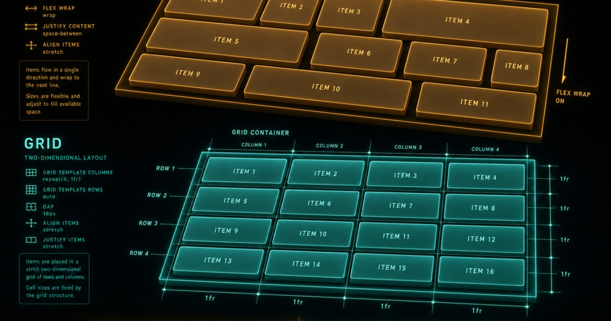
Here's the simplest way to think about it: Flexbox lays things out in one direction. Grid lays things out in two directions.
Flexbox works along a single axis — either a row or a column. It's excellent at distributing space among items and aligning them relative to each other. Grid works on a two-dimensional canvas of rows and columns simultaneously. It's built for placing items into a defined structure.
The practical translation: use Flexbox for components (navigation bars, button groups, card internals, form rows), and use Grid for page-level or section-level layout (the overall page structure, gallery grids, dashboard panels).
That said, the line isn't always clean, and knowing both well lets you choose based on the actual problem rather than a rule of thumb.
Flexbox: The One-Dimensional Workhorse
Flexbox turns a container into a flex container and its direct children into flex items. The two most important properties to internalize are flex-direction and how the axes work. The complete reference lives on MDN's CSS Flexible Box Layout module.
.nav {
  display: flex;
  flex-direction: row;        /* default: items flow left to right */
  justify-content: space-between; /* main axis distribution */
  align-items: center;        /* cross axis alignment */
  gap: 1rem;
}
justify-content controls distribution along the main axis (the direction of flex-direction). align-items controls alignment along the cross axis (perpendicular). This is where most people get tripped up — the axes flip when you switch flex-direction to column.
flex-wrap and Implicit Rows
By default, flex items squeeze into a single line. Add flex-wrap: wrap and items spill to new lines when they don't fit:
.card-row {
  display: flex;
  flex-wrap: wrap;
  gap: 1rem;
}

.card {
  flex: 1 1 280px; /* grow, shrink, basis */
}
flex: 1 1 280px is shorthand for flex-grow: 1; flex-shrink: 1; flex-basis: 280px. Each card starts at 280px, grows to share available space, and shrinks if needed. With flex-wrap: wrap, you get a responsive row of cards without any media queries.
flex-grow, flex-shrink, flex-basis
These three sub-properties define how an item sizes itself relative to its siblings:
flex-grow: how much of the remaining space an item claims (0 = don't grow)flex-shrink: how aggressively the item shrinks when space is tight (0 = don't shrink)flex-basis: the item's starting size before growth/shrinkage is applied
/* Sidebar + main content layout */
.sidebar { flex: 0 0 240px; } /* fixed width, no grow, no shrink */
.main    { flex: 1 1 0; }     /* fills all remaining space */
Grid: The Two-Dimensional Powerhouse
Grid gives you explicit control over both rows and columns at once. You can place items precisely into named areas, span them across multiple tracks, and define structure that items automatically flow into. The full module is documented on MDN's CSS Grid Layout reference, and CSS Tricks' complete guide to Grid is a useful illustrated companion.
.page-layout {
  display: grid;
  grid-template-columns: 240px 1fr;
  grid-template-rows: auto 1fr auto;
  grid-template-areas:
    "sidebar header"
    "sidebar main"
    "sidebar footer";
  min-height: 100vh;
}

.sidebar { grid-area: sidebar; }
.header  { grid-area: header; }
.main    { grid-area: main; }
.footer  { grid-area: footer; }
Named areas make the layout intention readable at a glance. At mobile breakpoints you just redefine the template.
The `fr` Unit
fr stands for fraction of available space. 1fr 1fr 1fr creates three equal columns. 1fr 2fr creates two columns where the second is twice as wide as the first. It's more flexible than percentages because it accounts for gaps:
.gallery {
  display: grid;
  grid-template-columns: repeat(3, 1fr);
  gap: 1rem;
}
auto-fill vs auto-fit
These two values for repeat() create responsive grids without media queries:
/* auto-fill: creates as many tracks as fit, leaves empty ones */
.grid-fill {
  grid-template-columns: repeat(auto-fill, minmax(200px, 1fr));
}

/* auto-fit: collapses empty tracks, items stretch to fill */
.grid-fit {
  grid-template-columns: repeat(auto-fit, minmax(200px, 1fr));
}
For most card grids, auto-fit is what you want — it expands items to fill the row rather than leaving ghost columns. For grids where items shouldn't stretch (like a toolbar), auto-fill preserves consistent item sizing.
Where They Overlap
Some layouts can be done with either tool, and the right choice comes down to intent. A simple three-column equal-width layout is trivially achievable with both:
/* Grid approach */
.three-col { display: grid; grid-template-columns: repeat(3, 1fr); gap: 1rem; }

/* Flex approach */
.three-col { display: flex; gap: 1rem; }
.three-col > * { flex: 1; }
For this case, either works. But if you later need one item to span two columns, Grid has a clean answer (grid-column: span 2) and Flexbox requires workarounds.
If you need items that reorder themselves based on intrinsic size, Flexbox's natural flow behaviour is a better starting point.
Using Both Together
The best layouts often use Grid at the outer level and Flexbox inside components. Grid establishes the structural skeleton; Flexbox handles internal component alignment.
/* Grid page structure */
.layout {
  display: grid;
  grid-template-columns: 1fr 3fr;
  gap: 2rem;
}

/* Flexbox card internals */
.card {
  display: flex;
  flex-direction: column;
  gap: 0.75rem;
}

.card-footer {
  display: flex;
  justify-content: space-between;
  align-items: center;
  margin-top: auto; /* push footer to bottom */
}
margin-top: auto on a flex child pushes it to the far end of the cross axis — a classic flex trick for sticking a footer to the bottom of a variable-height card.
The `gap` Property
Both systems share the gap property (previously grid-gap for Grid). It sets spacing between items without adding margins to edges:
.grid { display: grid; gap: 1rem; }          /* same gap in both directions */
.grid { display: grid; gap: 1rem 1.5rem; }   /* row-gap column-gap */
.flex { display: flex; gap: 0.5rem; }
gap is cleaner than using margins because it doesn't create double-spacing between items or unwanted margin on the first/last item.
Subgrid
Subgrid solves a long-standing limitation: child elements couldn't participate in a parent's grid tracks. With subgrid, a grid item can inherit its parent's row or column definitions:
.parent {
  display: grid;
  grid-template-columns: 1fr 1fr 1fr;
}

.child {
  grid-column: span 3;
  display: grid;
  grid-template-columns: subgrid; /* inherits parent's columns */
}
This is particularly useful for card grids where you want labels and values to align across cards. Subgrid is now supported in all modern browsers.
The Practical Decision
When starting a new component, ask: do I need to align things in two dimensions, or just one? Navigation bar, button group, input row, flex card — Flexbox. Page shell, dashboard layout, image gallery, grid of repeating items — Grid.
And when your CSS gets complex, keeping it lean matters. The CSS Minifier removes whitespace, redundant rules, and comments so what ships to users is as tight as possible.
For the specificity and cascade behavior that determines which layout rules actually win, CSS Specificity: The Complete Guide is essential reading. And to understand how these layout styles interact with the browser's rendering pipeline, CSS Custom Properties Explained shows how variables integrate cleanly into both Flexbox and Grid systems.
FAQ
When should I default to Grid instead of Flexbox?
Anytime you're laying out the page itself — header/sidebar/main/footer, dashboard panels, image galleries, card grids with consistent rows. Grid's two-axis control means you don't need to nest containers or fight for vertical alignment. For component-internal layout (a card's icon + title + button row, a navbar's logo + links + actions), Flexbox is usually faster to write and more flexible for content of varying widths.
What's `subgrid` good for in 2026?
The classic case is a card grid where each card has rows that need to align across the whole grid — a thumbnail, a title, a description, and a footer button, with each row vertically aligned across all cards regardless of content length. Without subgrid, you have to use fixed heights or accept ragged alignment. With subgrid, the children can opt into the parent's row tracks and align naturally. Browser support is universal in evergreens since 2023.
Can I use `gap` with floats or block layout?
No — gap only works on flex, grid, and (recently) multi-column layout. For old-school float or inline-block layouts, you need margins. This is one of the strongest practical reasons to migrate any remaining float-based layouts to flex or grid: gap eliminates the "first/last child margin" gymnastics that floats require.
What's the difference between `auto-fill` and `auto-fit` in `repeat()`?
auto-fill creates as many tracks as fit in the container, leaving empty tracks if the items don't fill all of them. auto-fit collapses empty tracks to zero width, so existing items stretch to fill the row. For card grids you almost always want auto-fit — empty ghost tracks look weird. For toolbars or fixed-size items where you don't want stretching, auto-fill preserves the intended item size.
Why does `flex: 1` not give me equal columns?
flex: 1 is shorthand for flex: 1 1 0 (grow, shrink, basis 0). Items size based on their content's intrinsic minimum, then divide remaining space proportionally. If one item has long content, its base size is larger and it ends up wider after distribution. To force equal columns, use flex: 1 1 0; min-width: 0 (which lets the item shrink past its content's natural minimum) or switch to grid with grid-template-columns: repeat(N, 1fr).
How do I make an image grid that's responsive without media queries?
Use grid auto-fit: grid-template-columns: repeat(auto-fit, minmax(200px, 1fr)). Items try to be at least 200px wide; the browser fits as many as the container allows; remaining items wrap to the next row. Combined with aspect-ratio on the grid items themselves, you get a fully responsive gallery without writing a single breakpoint. This pattern alone replaces probably 60% of media-query-based grid code.
Does Flexbox or Grid have better browser performance?
Both are highly optimized in modern engines and the difference is negligible for typical layouts. Grid layout calculation can be slightly more expensive on very large grids (thousands of items) because the browser computes track sizes across the whole grid. Flexbox is occasionally faster for one-dimensional component layouts because it skips the row-track resolution step. In practice, choose based on the layout shape, not performance.
Can I animate Flexbox or Grid layout properties?
Some, not all. gap, flex-grow, flex-shrink, flex-basis, and grid-template-columns (with FR-unit values) can animate in modern browsers. Properties that change the topology — grid-template-areas, adding/removing items — can't tween smoothly. For layout transitions (e.g. responsive reflow, item reorder), the View Transitions API is the modern answer rather than animating layout properties directly.